As soon as you have a new project in place, there are several steps, you should take. Whether you are forming a new band or starting a business, branding, today, is inevitable.
After you accomplished to come up with a good name, it’s time to think about a unique logo, that serves your band or brand name.
The Easiest thing would be to hire a talented designer and leave it all up to him. However, when starting out with little or no budget, it’s questionable if it’s worth the investment. I’ve done that once and what I got for my money kept me thinking, I could do this as well.
The aim of this article is to address the main questions on how to create your own logo for free. There are brilliant ways to become your own graphic artist, without having any special design skills.
What Is A Logo?
The name logo is an abbreviation of logotype, which comes from Greek logos “word” and typos “imprint”.
A logo is a graphic mark, emblem, or symbol used to aid and promote public identification and recognition. It may be of an abstract or figurative design or include the text of the name it represents as in a word mark.
-Wikipedia-
So, there are basically 3 different types of logos.
1) Text only: A word mark, where the brand name is used, e.g. Coca Cola, Google,
2) Image only, e.g. Apple logo
3) Text and Image: That’s the most common logo type.
Although of great importance, a logo is just a part of the brand identity. Other elements are e.g. photography, web design, illustrations.
Do You Need A Logo Anyways?
There’s a saying that goes “It’s optional to be professional”. From my perspective, if you start a project with the intention to promote (someday), you should get a name and a logo in place straight away.
As I often relate to music projects, bands, whatsoever, it makes a huge difference, if you have a band name, a logo and a website or if you just “fooling around” and playing some music.
People are interested. When you tell someone, you make music, he will ask questions like “What’s the name of the band?”, “What music do you play?”. He will probably pull out his smartphone and google the band name and browse to your website. If, what he finds there looks professional (web design, logo, photos,..), he will occasionally spread the word.
That’s free promotion right from the start.
Basic Visual Identitiy Rules
You don’t have to become an expert in graphic design to make your own logo, but there are some basic rules you should follow.
Color: Usually, you will settle for a fixed color scheme that will be used throughout 90% of your visual marketing (website, flyers, business card, e-mail signature,.). Choose wisely, which color you want to pick for your logo.
I found a great article, that explains what each color stands for. Besides your core color scheme, you always have the opportunity to use a black & white version of it.
Font: A predefined font style is crucial to brand identity and should never be changed. If you are more experienced with graphic programs like Adobe Illustrator, you can create your own, unique font.
Case Study: Creating A Logo With Free Logo Maker
As I need a new logo for myvocalskills.com, I decided that this would be a great opportunity (and fun) to make a little case study. So you can see, what results to expect from free logo creating tools.
I picked three logo makers, that were listed as top results, when doing a Google search.
Step 1: Choose your industry.
Step 2: You can select up to 3 different visual styles.
Step 3: You then enter your business name and a slogan (optional).
In the next step, you can tell the program, where you want to use your logo, so they can provide you with the optimized sizes.
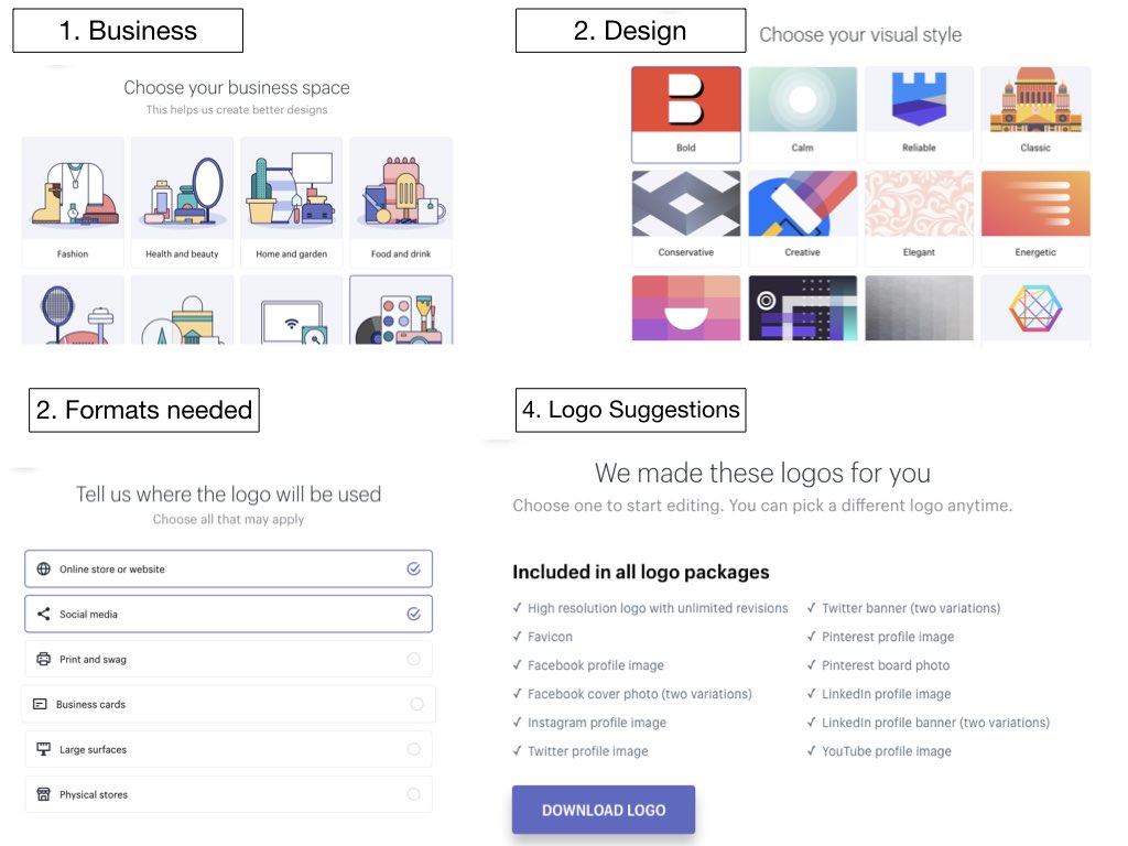
It took me less than 3 minutes to finally get 30 different logos to choose from, all of them varying in color, font and style.
If you go for it, they send you an e-mail and provide you with the download. You get all optimized formats for free – no strings attached. Awesome!
The Logomakr is not as automated as Hatchful and Designhill. You can watch a little tutorial video, to learn how to use the tool, although it is very intuitive. Nevertheless, you have to design it more or less yourself.
Type in the name, choose an icon, color and font and arrange everything the way you want it. If you want more creation freedom, that’s the one for you.
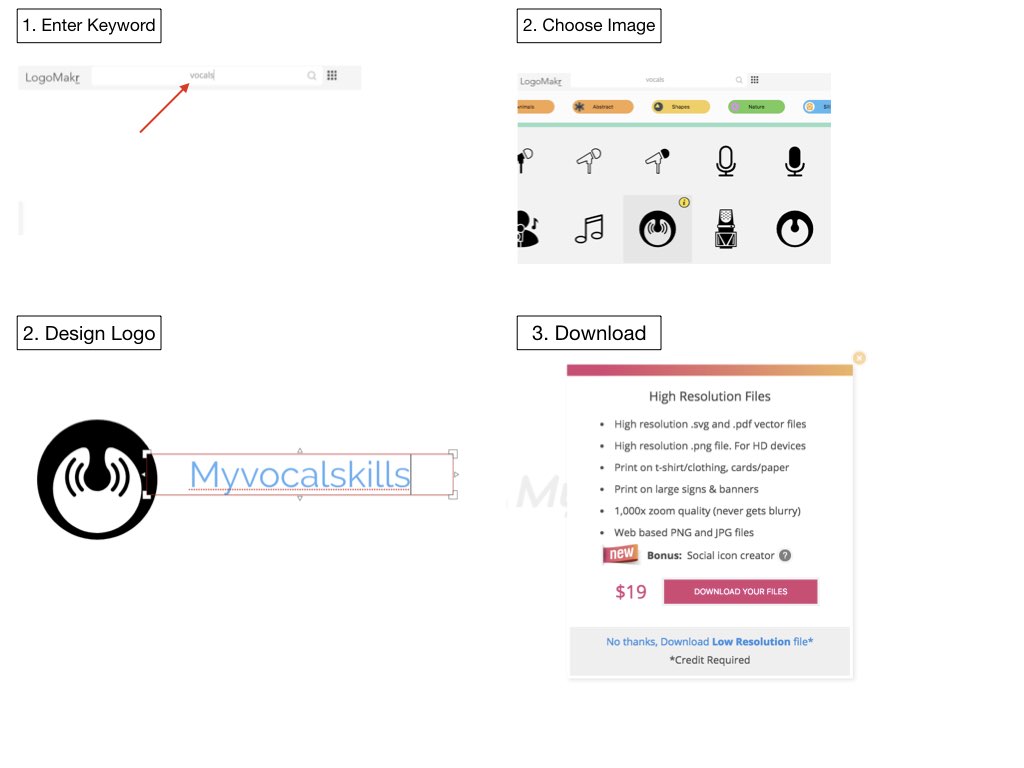
Eventually, you can only download a low resolution version of your logo. If you want to get in high resolution, they charge you $19. So it’s not really for free.
Self-claimed no.1 logo maker. It’s a 4 step process to your logo.
Step 1: Enter name
Step 2: Pick a design. They have really nice designs, that don’t look generic. You can select up to 5 different ones.
Step 3: Pick a color scheme
Step 4: Choose an image
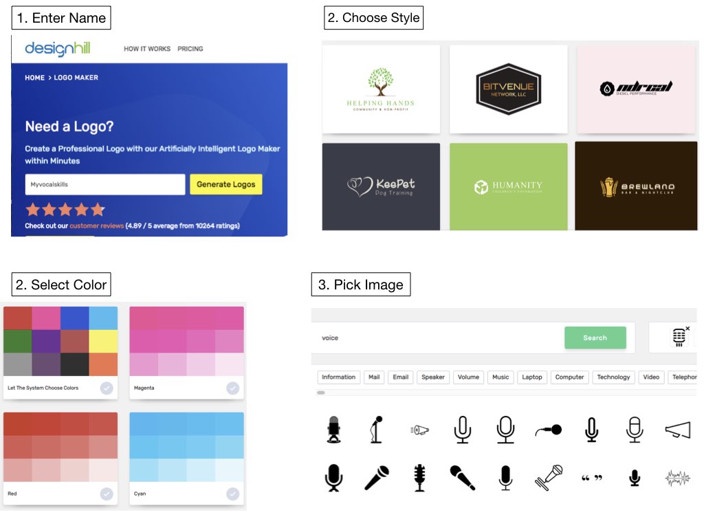
Finally, you can make all kind of adaptions to your logo as you want. If you want to download, you don’t get anything for free. Even the basic resolution version costs $ 20.
Take A Look At The Results
Drum roll – Here are my results from the 3 different logo design online tools!
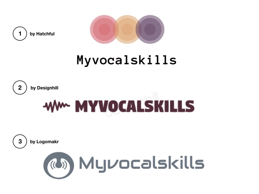
Not bad, ha?
A Different Approach To Free Logo Design
Okay, so here’s what I basically do. I think those free logo makers are a good start, if you are totally blank. You can get some good ideas. If you are a little experienced with vector graphic programs, like Adobe Illustrator, you can do following:
1. Pick up one of the ideas, you got from experimenting with a free logo creator.
2. Go to a free vector graphics page like Freepik
3. Find your desired graphic
4. Download from the site and upload to your graphic program
You can then tweak the image a bit, to make it unique, add name and select the font. It’s pretty simple and you will not only save some money, but make a real unique logo.
Conclusion
Designing a logo for your band or any other business project isn’t that hard and doesn’t require an army of graphic experts. With the support of free online tools, you can come up with some good designs pretty quickly.
For a relatively low price you can then purchase them in higher resolution from them or go on and finish a unique logo on your own. When using your logo, just keep in mind to stick to the predefined colors, fonts and dimensions to ensure maximum brand.
That’s it. I hope you find my article useful.
Please leave a comment and share your thoughts and own experiences. Furthermore, I really want to know: WHICH LOGO FROM MY CASE STUDY DO YOU LIKE BEST?
Rock on
Felix

Logo is an important aspect of creating brand recognition and a fundamental part of an authority website. People recognize images more easy than test as we are visual animals and thus seeing a familiar picture that we can immediately relate is the best course of action. No serious marketeer or businessman should start a business without creating a logo for his company. And with the tools provided nowadays it’s so easy to create one without any money. It doesn’t have to be anything fancy as you can see so many top brands use simple graphics. Those unfamiliar with basic Photoshop skills will find your suggestions very helpful in order to create their first logo. Great article.
Hi Felox – Can I throw a spanner in the works? I love the font of exmaple 1 but the little heart monitor graphic of number 2 – it is my personal preference but I like Title Case headings not all caps. That aside, thanks for your article, I created a basic logo for my business in Canva but it is not where I see others to be. Being a new business I didn’t have the money to hire someone to create it so these tools are going to be fantastic.
I cant wait to try them – which would you suggest for someone not really techincally savvy such as myself?
Paul
Hi Paul, thanks for commenting. Your feedback on my logos is much appreciated. That’s the way it goes. You have 3 different and probably end up combining them to get the ultimate result.
You don’t have to be technically savvy. Neither am I. They are all so easy and you get designs in less than 5 minutes. It’s really a great opportunity.
I have been looking for a logo creator and I just tried design hill right now. The amount of combinations you can use to create a logo seem endless.
Are these logo creators more sophisticated or more advanced than Canva? I have been using canva for the past year in order to create some logos.
Hi Jessie, thanks for your comment. I would say, that non of them are sophisticated. As described Designhill and Hatchful delievers results pretty much automated. Logomakr requires more self-handling, but it’s easy though. Just try all 3 and see what works best for you.
Great article, very informative and clear. I have been wondering whether I should get a logo or not for my website, still not sure but after reading your article it is much clear why I need one and I can see the importance.
If and when I decided to get one I will use your information as a guide to creating my logo.
Once again great article.
Excellent resource of free logo makers – I spent last week looking at software for making logos, and I’m so pleased I didn’t purchase any now (the results of the logos you made are very professional).
I think I’m leaning towards using your first option, Hatchful, as my choice of software for creating a website logo. Which of the three did you find the most professional looking?
Great info on creating your own logo. BTW I like number 1 logo from Hatchful best. I’m not a fan of very literal logos, I like those that are a bit less obvious. Thanks for the information on resources to create a logo. Many years ago I trained as a graphic designer where everything was drawn by hand and lettering was also hand drawn. It was all very time consuming. How times have changed.
Those are great efforts. I didn’t even know there were tools like this, that is so cool. I always thought creating a logo would cost a lot of money, but because I now stumbled on this article, I see it really doesn’t have to be expensive.
I like version 2 best, by the way, the designhill one.
congratulations, very helpful as article. Logo is very important for a serious business. Imagine how many rimes we are in front of dilemma to bye a pair of snickers of unknown mark versus a registered one e.g.: famous mark as adidas or nike. Thus the logo is the image of the business to represent itself toward to the market.
I bookmarked your website. Absolutely loved the article, furthermore it came just in time for me as I’ve been looking into developing a new solid logo for my brand. 🙂
“It’s optional to be professional!” – loved that saying, hadn’t heard it before, but it does characterize the effort perfectly. The tips on color choosing were also brilliant. And the case studies were also solid. Will definitely check out some of those applications to try out the making of a logo.
Thank you for all the insights, I found real value in this. And I appreciate it!
Cheers and have a Great One!
Matiss
Loved it, loved it, loved it! Such an awesome article, Felix! I had no idea that one can create a really professional looking logo without using any paid tools.
The Designhill looks so dead simple to use and the result is brilliant, however, I’m really not looking into investing additional money into creating that logo of mine. I will try it out though just to see how it looks. At the same time I think your approach is very well thought out. So, I’ll look into that as well.
The visual identity rules I found very helpful, which definitely rose some curiosity as towards are there any other interesting tips or tricks one should be either keeping in mind or implementing. It would totally make my day, if you’d share some more. 🙂
But either way, thank you, Felix! I appreciate the time and research it took to make this article happen!
All the best,
Rasa
Thank you Rasa for this nice comment. I’m really glad, if I could help you and showed you an easy way for making your own awesome logo. All the Best.